Click to enlarge – What makes up a Typeface?
Sourced from the Bold & Justified Infographic at www.fontfeed.com
A typical book has between 25,000 and 100,000 words. They are the feature of the book that readers interact with the most, spending hours poring over them. But when was the last time you read a book and thought “Wow, that plot twist at the end blew me away and the font choice of 11pt Baskerville Old Face was a masterful touch!”
The fact is that, despite all the close scrutiny that the body text of a book receives, most readers fail to notice the careful design choices made by the publisher at all—and that is how it should be. Imagine listening to a long speech by a man who constantly waves one hand around wildly as he talks, or a woman who speaks so quietly you have to strain to hear each word. How long do you think you would be able to stay focused on the speaker’s words? It’s the same for books—as readers, we want to stay absorbed in the meaning of the writer’s words, without being distracted by quirky lettering or frustrated by font that is too small to read clearly.
The choice of a font for the body text is one of the most important but under appreciated decisions you will make in formatting your book. No reviewers will applaud a well considered typeface but readers will tune out in droves if you get it wrong. Unlike the cover design which aims to call attention to itself, the body text must be unassuming and the primary consideration when choosing a font is always Legibility and Readability. There are over 90,000 fonts currently available so the choice can be a little overwhelming to say the least, so here is some general advice about how to decide and my list of ten fonts that will work in most occasions.
Selecting a Font – Typeface and Point Size
The word ‘font’ is now commonly used interchangeably with the term ‘typeface’ due to the influence of modern publishing software. However, the terms do in fact have distinct meanings in typography. A typeface is a complete set of characters (upper case & lower case letters, numbers and symbols) that have been designed in with similar features to create a distinct textual style. In contrast, a font is a specific combination of typeface and point size. For example, a typical book might use the typeface Garamond with a point size of 10, so the font is 10-point Garamond. Furthermore, 10-point Garamond is a separate font to 12-point Garamond.
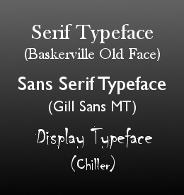
There are thousands of typefaces available, each with its own distinct style and each suited to different publishing purposes. They can be broadly broken into 3 main categories:
- Serif Typefaces – include small ‘serifs’, or feet, and other small flourishes such as hooks that help the eye group letters together into words and increase readability of printed text
- Sans Serif Typefaces – contain no serifs for cleaner lines that are more legible at smaller point sizes (such as footnotes) or on lower resolution mediums such as computer screens and poorer quality paper
- Display Typefaces – illustratively designed fonts built around a specific theme
When deciding which type of font to use you first need to determine how your book is going to be read. If your book is going to be printed, the general rule is to use a serif typeface for the body text and a sans serif typeface for the headings, footnotes and cover design. An eBook, on the other hand, is more likely to be read off a screen and so you may choose to switch these around and use a sans serif typeface for the body text as this will be easier to read on small screens and low resolution. Display typefaces should be reserved for cover design and headers and are commonly used in children’s books for this purpose.
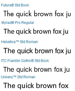
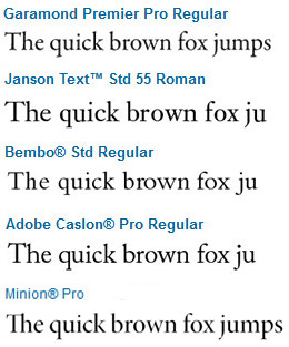
There are a number of well established typefaces that have been designed specifically to serve as the body text of books. These tend to be serif fonts because the printed book has been the dominant format for hundreds of years but there are plenty of sans serif fonts that work well. The lists below gives a great snapshot of five serif and five san serif typefaces that are popular for internal book design:
5 Serif Typefaces that can’t fail:
1: Garamond: Hugely popular in print books for its elegant script – widely regarded as one of the most legible and readable – and for the fact that it is one of the most eco-friendly fonts in terms of ink usage
2: Janson: Distinguished by the contrast between the thin and thick strokes, this has a strong character and classic feel that gives the writing a certain literary distinction
3: Bembo: Considered an excellent typeface for books for its classic beauty and ability to create a very even colour and texture on the page
4: Caslon: known for its slightly more irregular appearance and distinctive texture on the page, Caslon is a very popular font in text books
5: Minion: an economical script and one of the most widely used book faces since its creation in the 1990’s

Sans serif fonts stay legible at small point size and at low resolution, such as on computer screens
5 Popular Sans Serif Typefaces:
1: Futura: an all-purpose typeface prized for its efficiency and sharpness, it inspired a proliferation of geometric fonts after it was released in 1927 and remains one of the most popular fonts in publishing and graphic design
2: Myriad: the typeface of choice for many internet giants, including Google, Linked-in, Mashable, and, most recognisably, Apple’s iPod, Myriad is ideally designed for text destined to be viewed on a screen
3: Helvetica: possibly the most commonly used typeface by graphic designers around the world for its clean simplicity and legibility, Helvetica is a good choice for information rich books with a serious or neutral tone
4: Franklin Gothic: often referred to as the American Helvetica, Franklin Gothic is a slightly heavier typeface most recognisable for its use in Scrabble tiles but also extremely popular in magazine headings and gallery catalogues
5: Univers: with clear lines and distinctions between characters, Univers is an extremely legible typeface that is often used for school exams and other publications where clarity is important
A few more tips to keep in mind when selecting a font:
- The effect of the font will be different on a printed page than on a computer screen so always print your shortlist of fonts to determine their true look and feel – use the same paper stock, paper size and print quality that you plan for the book itself and bundle a few pages together to view the effect in book form
- Different typefaces at the same point size will appear larger or smaller depending on the height and the width of the glyphs and the spacing between the letters – an economical font that allows more characters on a page without compromising on legibility will help to keep the page count down and save printing costs.
- When sourcing a font, make sure that it contains the complete set of characters as well as separate typefaces for Roman, Bold, Italics, Condensed and other variations – many cheap or free font packages contain only the basic Roman typeface and apply a ‘fake’ bold or italic that will not look correct
- Remember that typefaces are copyrighted products and so many of the recently designed fonts from the past 50 years need to be purchased so the designer can make royalties – if you are looking for a free font then use one that comes standard with your design software
- However, don’t trust the default fonts in your design software – using Times New Roman or Arial will instantly mark you as unprofessional as these fonts are simply not designed for the body text of books and should be avoided even when submitting manuscripts to publishers
- Headings are a chance to create contrast and add some additional tone to your book so carefully consider the combination of body text and header fonts used in your book – as a general rule you should juxtapose serif and sans serif fonts of different styles and let the header font resonate with the themes and emotion of your book
Want some further font references?
Adobe has a useful font finder tool on its website that you can use to research different typefaces and most books will contain a reference to their typeface on the copyright page, so you can see firsthand how they look on the page. You should also check out Julian Benson’s wonderful (and slightly tongue in cheek) Flow Chart for choosing a typeface as well as the incredible infographic Bold & Justified which neatly explains everything you could ever want to know about Typography. If you are trying to find a good font combination for the body text and headers your book then try Douglas Bonneville’s 19 Best Font Combination Chart for some great examples.
The next post in the Self Publishing Series will delve further into Typography and unlock the hidden secrets of kerning, tracking and leading …


Reblogged this on balilifelately and commented:
hoping wishing preying
What are you hoping wishing preying for?
JM
Hoping, wishing, praying…
Its like you read my thoughts! You seem to grasp so much approximately this, like you wrote the guide in it or something.
I feel that you could do with a few p.c. to power the message home a bit, however other than that, this is
great blog. A fantastic read. I’ll certainly be back.
Thanks for the excellent info!
grerat publish, very informative. I’m wondering why the other experts oof this sector do not notice this.
You should proceed your writing. I’m confident,
you’ve a huge readers’ base already!
Thank you. Very helpful! I know of several others who will be interested in seeing your post.
Thanks for this. I have written 2 chikdren’s fantasy books and a YA/ chick lit one. I am using Georgia 12 pt with Franklin Gothic Heavy 20 pt on the half title page. This is for my proof copy . I am on the search for a cover font and have no idea which will work. I have used fonts I can read as I have a visual impairment
This was very useful information. I knew my book did not look right in the standard Times Roman font – but I did not know which typeface to use until I read this. Thanks!.
Good information. But, ironically, I have to mention that the font used in this post is not all that easy to read. Increasing the point size would certainly help, but as a screen font, it seems to me that it leaves a bit to be desired. The text color is uneven on my screen, and that’s distracting.
Thanks for the comment Teri. It’s funny that you mention this, as I have just this week been tinkering with the site design, including trialling a few different fonts. So this is very timely and valuable feedback. It also shows just how tricky it can be to find the right typeface. I’ve just changed it back to the original font settings.
You may want to change “san” to “sans”, since “sans” means “without” in French.
Fine way of explaining, and pleasant paragraph
to get facts regarding my presentation subject, which i am going to present in college.
Reblogged this on When Angels Fly.
Thank you for the advice really helpful. 🙂
Reblogged this on MorgEn Bailey – Editor, Comp Columnist/Judge, Tutor & Writing Guru and commented:
Interesting stuff…